Von_Lipwig's Blog
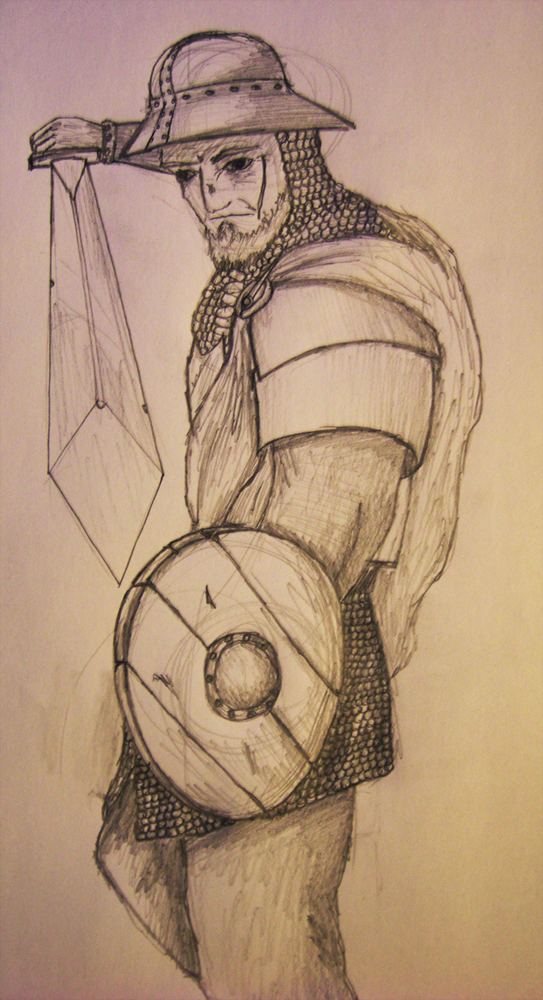
Forum Turn-Based Strategy Game - Concept art #1: Grizzled Veteran
by , 09-07-2011 at 09:11 PM (28376 Views)
I thought I'd give you guys something else for a change. Let's face away from the numbers and maths and systems and let's look at another aspect of the game: its visual style.
Visual Style and Setting
The game is set in a medieval-style fantasy world, with a noticable lack of magic. You could in fact compare it to Mount and Blade, which is similarly themed.
Units and armour will be designed with functionality in mind, not because it has to look 'cool'. This will mainly be done to keep a certain level of authenticity even though it is a fantasy world.
Unit cards
I am planning to make a unit card for each and every unit. I am well aware I may regret that decision, so I will not promise anything as such. I can only say I will try my hardest not to be discouraged by the amount of work still ahead of me.
Why? Because those unit cards will not only have the unit's stats but also an illustration so as to make it easier to imagine what the unit may look like. This means I will have to draw quite a lot of units, and I'm not even getting money for it!
Grizzled Veteran
Tonight, I wanted to make some first concept art, mainly to practise my drawing hand and to see if I still have 'it'. I think I can say my first attempt worked out quite well, and I wouldn't be surprised if this made it into the final version of the game.
So, without further ado, the Grizzled Veteran, from the Veterans' faction:
Look out for more concept art as the game progresses! These will be post in-between regular blog posts. I have no idea what my next project will be yet.


 Email Blog Entry


